The team had built a powerful AI hiring engine, yet every pitch opened with a disclaimer: “Ignore the logo, we’re redesigning.” Past agencies handed them fragments—clever marks that never matched the product or each other.
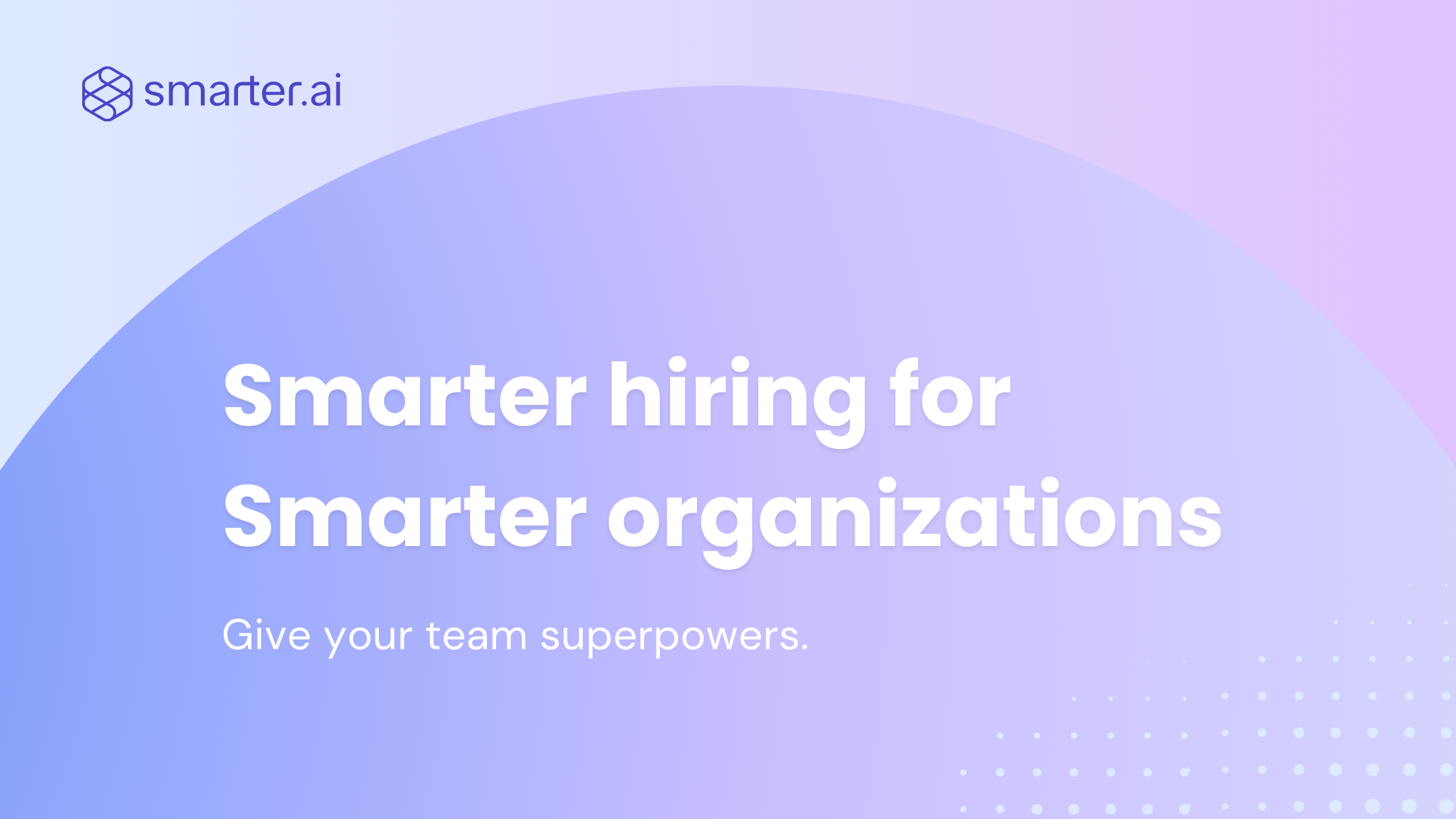
We began with a single question: What does a friction-free hire feel like? The answer shaped everything. Two continuous lines fold into an unmistakable “S,” showing a path with no dead ends. A violet-to-lilac gradient lifts the form, hinting at insight rising out of data. Typography stays open and spacious, mirroring the ease the software promises. Launch day came; the slides, the site, the dashboard—every surface spoke in one voice. Investors stopped asking about the product name. They already knew it.
Most brands fail because they look generic or break when applied across different platforms. Companies waste time with inconsistent visual systems that don't scale from digital to print.